Visualizing Global Economic Shifts: An Interactive Analysis
In today’s interconnected world, global events can send ripples across financial markets in mere hours. But how can we begin to understand these complex relationships? To answer this question, I embarked on a data-driven journey to analyze the economic effects of major global events, from the COVID-19 pandemic to long-term trends in the global arms trade.
The result is the Global Economic Impact Analysis project, a collection of interactive visualizations designed to make complex data accessible and understandable. Using Python, Pandas, and Plotly, I transformed raw data from sources like the World Bank, SIPRI, and Bloomberg into a series of dynamic charts and maps. For a high-level summary, you can view the project page in my portfolio.
Visualizing the Unseen: A Tour of the Key Charts
The project features over a dozen interactive visualizations. Here are a few highlights:
1. The V-Shaped Recovery: US Homebuilder Confidence During COVID-19
The pandemic caused unprecedented economic shocks. This chart of the NAHB Market Index captures the dramatic collapse and subsequent record-breaking boom in the U.S. housing sector, a key indicator of economic health.

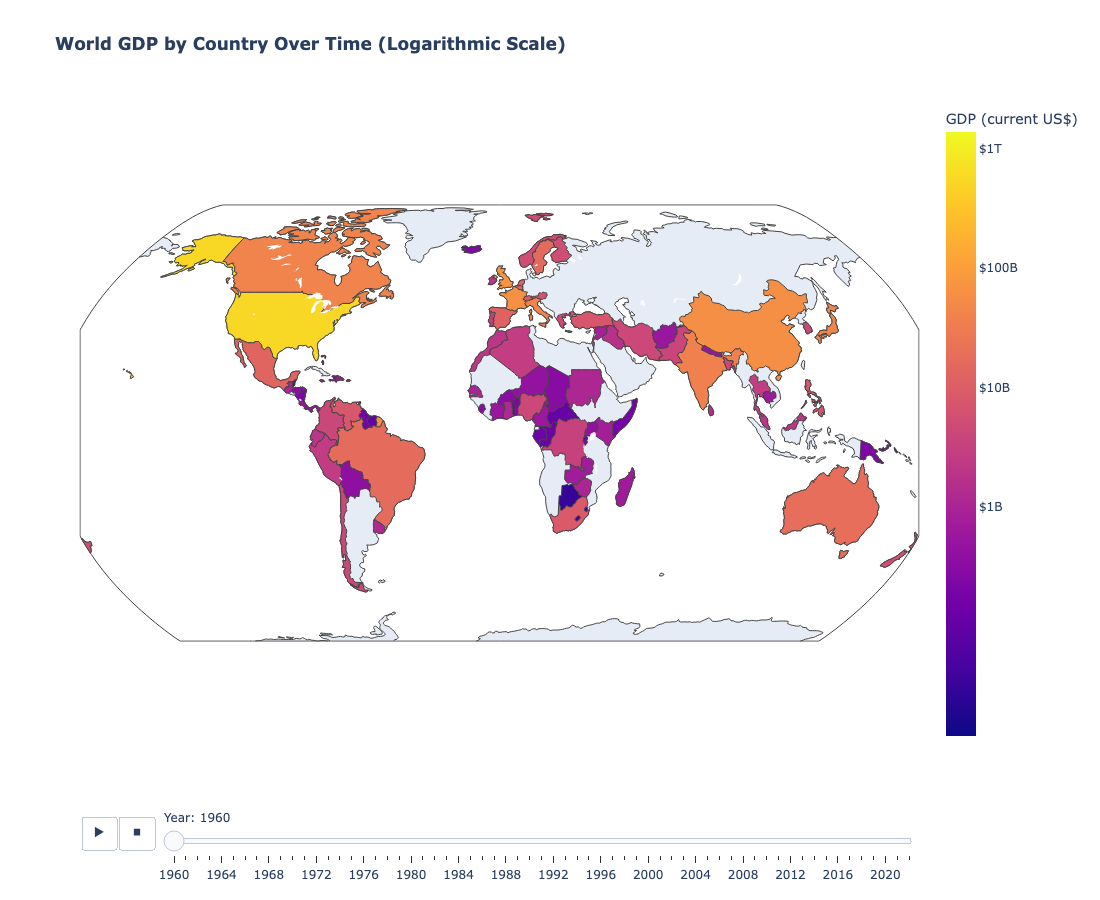
2. A World of Wealth: Animated Map of GDP (1960-2022)
This animated choropleth map provides a powerful geographic visualization of how global wealth has shifted and grown over the last 60+ years. Watching the evolution of GDP distribution from 1960 to 2022 reveals the rise of new economic powers and the changing landscape of the global economy.

3. The “Guns vs. Butter” Dynamic
This animated bubble chart explores the classic “Guns vs. Butter” economic model by comparing a nation’s economic output (GDP) with its spending on arms imports. The animation reveals fascinating trends in how the top 15 importing nations allocate their resources over time.

The Technology Behind the Visualizations
This project was a deep dive into the modern data science stack:
- Data Wrangling and Analysis: Python with Pandas and NumPy for cleaning, transforming, and analyzing the datasets.
- Data Visualization: Plotly for creating a wide range of interactive charts and maps. Matplotlib and Seaborn were used for static plots and initial data exploration.
- Data Sources: The analysis is built on data from reputable sources, including the World Bank (GDP data), the Stockholm International Peace Research Institute (SIPRI) (arms trade data), and Bloomberg (financial market data).
Explore the Full Analysis
This blog post only scratches the surface of the Global Economic Impact Analysis project. I invite you to explore the full set of interactive visualizations on the project page and to dive into the code on GitHub.
Enjoy Reading This Article?
Here are some more articles you might like to read next:
- More Than Code: Building a Digital Community From the Ground Up
- A Journey into Automotive Design with Computer Graphics and Linear Algebra
- From Broken Builds to a live Portfolio on the internet: A Jekyll & al-folio Journey
- Case Study: Building a Full-Stack University Shuttle Bus App on AWS