Global Economic Impact Analysis
A data-driven analysis of the economic effects of global events on financial markets, using Python, Pandas, and Plotly for interactive visualizations.
Global Economic Impact Analysis: Interactive Visualizations
This document provides an overview of the interactive data visualizations from the “Global Economic Impact Analysis” project. Each chart is designed to be explored, allowing for a deeper understanding of the complex relationships between global events and economic trends.
For full interactivity with all charts, please clone this repository and run the Global Economic Impact Analysis.ipynb notebook in a local Jupyter Notebook or JupyterLab environment (e.g., via Anaconda).
Table of Contents
- Global Economic Impact Analysis: Interactive Visualizations
- Table of Contents
- 1. World GDP Over Time (1960-2022)
- 2. Seasonal Decomposition of World GDP
- 3. World GDP Forecast
- 4. GDP Trajectories of Major Economies \& Top Arms Traders
- 5. Animated World Map of GDP (1960-2022)
- 6. Monthly Net Aircraft Orders: Airbus vs. Boeing
- 7. Evolution of U.S. Defense Budget Composition (1999-2023)
- 8. Changing Composition of Global Arms Imports (1950-2022)
- 9. Cybersecurity Fund Flows vs. NASDAQ Trend
- 10. Airline Bankruptcy Risk During COVID-19
- 11. US Homebuilder Confidence: The COVID-19 V-Shaped Recovery
- 12. Animated World Map of Arms Trade Volume (1950-2022)
- 13. Composition of Global Arms Exports by Category (1950-2022)
- 14. Animated Bubble Chart: GDP vs. Arms Imports
- Table of Contents
1. World GDP Over Time (1960-2022)

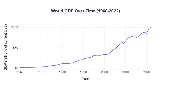
This line chart provides a foundational view of global economic growth over the past six decades, illustrating a strong, accelerating upward trend.
- Interactivity:
- Hover: Move your cursor over any point on the line to see a tooltip displaying the exact year and the corresponding World GDP in trillions of US dollars.
2. Seasonal Decomposition of World GDP

This set of four static plots breaks down the World GDP time-series into its fundamental components: the observed data, the long-term trend, the seasonal patterns (which are flat for annual data), and the random residuals.
- Interactivity: This is a static
matplotlibchart and is not interactive.
3. World GDP Forecast
This chart displays the historical World GDP data alongside a 10-year forecast generated by an ARIMA model.
- Interactivity: This is a static
matplotlibchart and is not interactive, but it visually presents the model’s projections and the confidence interval surrounding them.
4. GDP Trajectories of Major Economies & Top Arms Traders

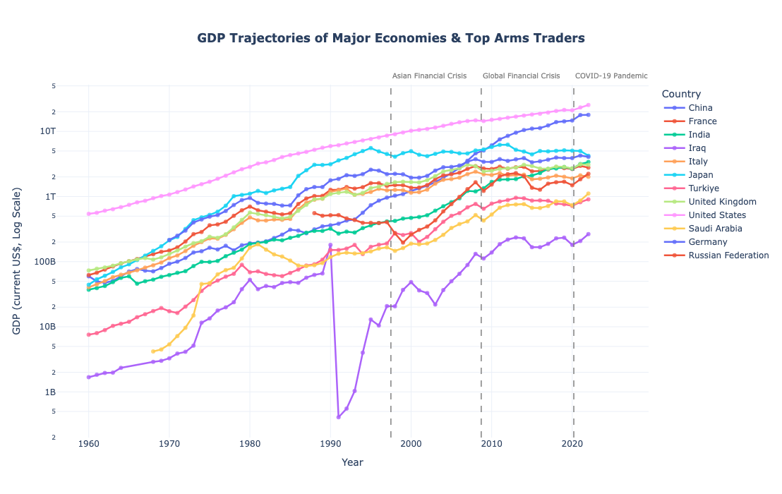
This multi-line chart compares the economic growth of the world’s major economies and top arms-trading nations, plotted on a logarithmic scale to effectively compare countries with vastly different GDPs.
- Interactivity:
- Hover: Hover over any line to see a tooltip with the country’s name, the specific year, and the exact GDP for that year.
- Click Legend: Click on a country’s name in the legend to hide or show its corresponding line on the chart, allowing for focused comparisons.
- Zoom: Click and drag on the chart to zoom into a specific time period. Double-click to reset the view.
5. Animated World Map of GDP (1960-2022)

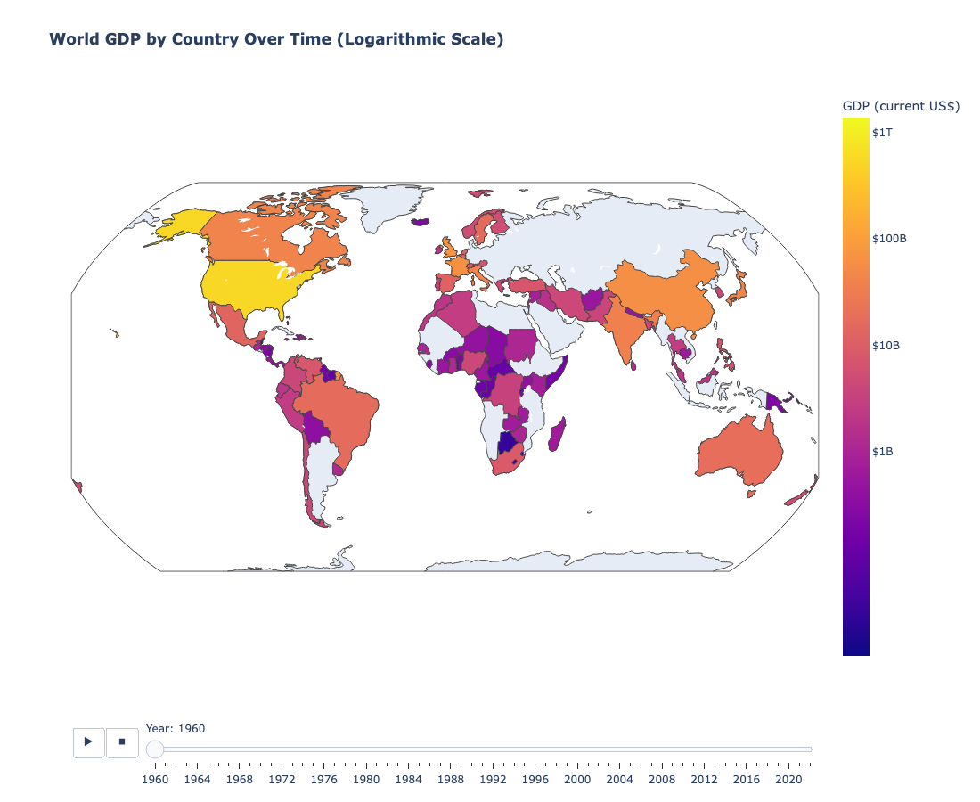
This animated choropleth map provides a powerful geographic visualization of how global wealth has shifted and grown over the last 60+ years.
- Interactivity:
- Animation Slider: Use the slider at the bottom to manually scrub through the years or press the “Play” button to watch the evolution of global GDP distribution from 1960 to 2022.
- Hover: Hover over any country to see its name, GDP for the selected year, and its Log GDP value.
- Pan & Zoom: Click and drag to move the map, and use your mouse wheel to zoom in on specific regions.
6. Monthly Net Aircraft Orders: Airbus vs. Boeing

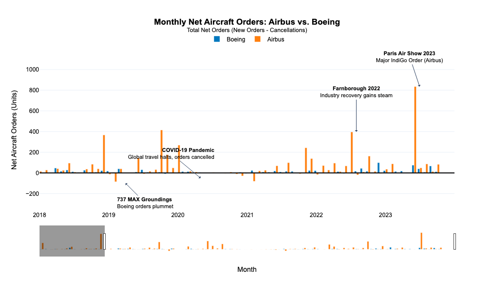
This grouped bar chart provides a case study on the commercial aerospace industry by visualizing the monthly net orders for its two largest manufacturers.
- Interactivity:
- Hover: Hover over any bar to see the manufacturer, the month, and the net number of aircraft orders.
- Range Slider: Use the range slider at the bottom to zoom into a specific period, such as the onset of the COVID-19 pandemic or the 737 MAX groundings, to analyze their impact more closely.
7. Evolution of U.S. Defense Budget Composition (1999-2023)

This stacked area chart shows how the allocation of the U.S. Department of Defense budget has shifted between major categories like Operations, Procurement, and R&D over the past two decades.
- Interactivity:
- Hover: Move your cursor across the chart to see the budget allocation for each category in any given year.
- Click Legend: Click on a category in the legend to hide or show it, allowing you to analyze the trends of specific spending areas.
8. Changing Composition of Global Arms Imports (1950-2022)

This 100% stacked area chart visualizes the evolving technological priorities in the global arms trade by showing the proportional share of different weapon categories over time.
- Interactivity:
- Hover: Hover over a colored area to see the percentage share of that weapon category for a specific year.
- Click Legend: Click on a category in the legend to toggle its visibility.
9. Cybersecurity Fund Flows vs. NASDAQ Trend

This combination chart visualizes investor sentiment in the cybersecurity sector by plotting monthly net flows into major cybersecurity ETFs alongside the general market trend of the NASDAQ-100.
- Interactivity:
- Hover: Hover over the bars to see the net fund flow for a specific ETF in a given month. Hover over the dashed line to see the simulated NASDAQ-100 price.
- Click Legend: Toggle the visibility of each ETF or the NASDAQ trend line.
10. Airline Bankruptcy Risk During COVID-19

This line chart quantifies the perceived market risk for the airline industry by plotting the Credit Default Swap (CDS) spreads for North American and European airline indices.
- Interactivity:
- Hover: Hover over the lines to see the region and the precise CDS spread in basis points at any point in time.
- Zoom: Click and drag to zoom into specific periods of market stress.
11. US Homebuilder Confidence: The COVID-19 V-Shaped Recovery

This chart tracks the NAHB Market Index, a key indicator of the U.S. housing sector’s health, showcasing its dramatic collapse and subsequent record-breaking boom during the pandemic.
- Interactivity:
- Hover: Hover over any point on the line to see the year and the corresponding index value.
12. Animated World Map of Arms Trade Volume (1950-2022)
This animated choropleth map visualizes the geographic centers of the global arms trade (imports + exports) and how they have shifted from the Cold War to the modern era.
- Interactivity:
- Animation Slider: Use the slider and play button to see how the global arms trade landscape changes each year.
- Hover: Hover over a country to see its name and total arms trade value for the selected year.
- Pan & Zoom: Navigate the map to focus on specific regions of interest.
13. Composition of Global Arms Exports by Category (1950-2022)

This donut chart provides a high-level summary of the entire global arms export market from 1950 to 2022, broken down by major weapon category.
- Interactivity:
- Hover: Hover over a slice of the donut to see the weapon category and its total percentage of the global market over the entire period.
- Click Legend: Toggle categories on and off to see how the proportions of the remaining categories adjust.
14. Animated Bubble Chart: GDP vs. Arms Imports

This animated scatter plot explores the “Guns vs. Butter” dynamic by comparing a nation’s economic output (GDP) with its spending on arms imports.
- Interactivity:
- Animation Slider: Use the slider and play button to watch how the relationship between GDP and arms imports evolves for the top 15 importing nations over time.
- Hover: Hover over a bubble to see a detailed tooltip showing the country’s name, its GDP, its arms import value, and a calculated metric of its imports as a percentage of GDP for that year.
- Click Legend: Isolate specific countries by clicking their names in the legend.